Maison Therese
Maison Therese has come a long way, from humble beginnings in a packaging shed in Hastings, their range of preserves has fostered a nationwide obsession with food lovers and chef’s alike.
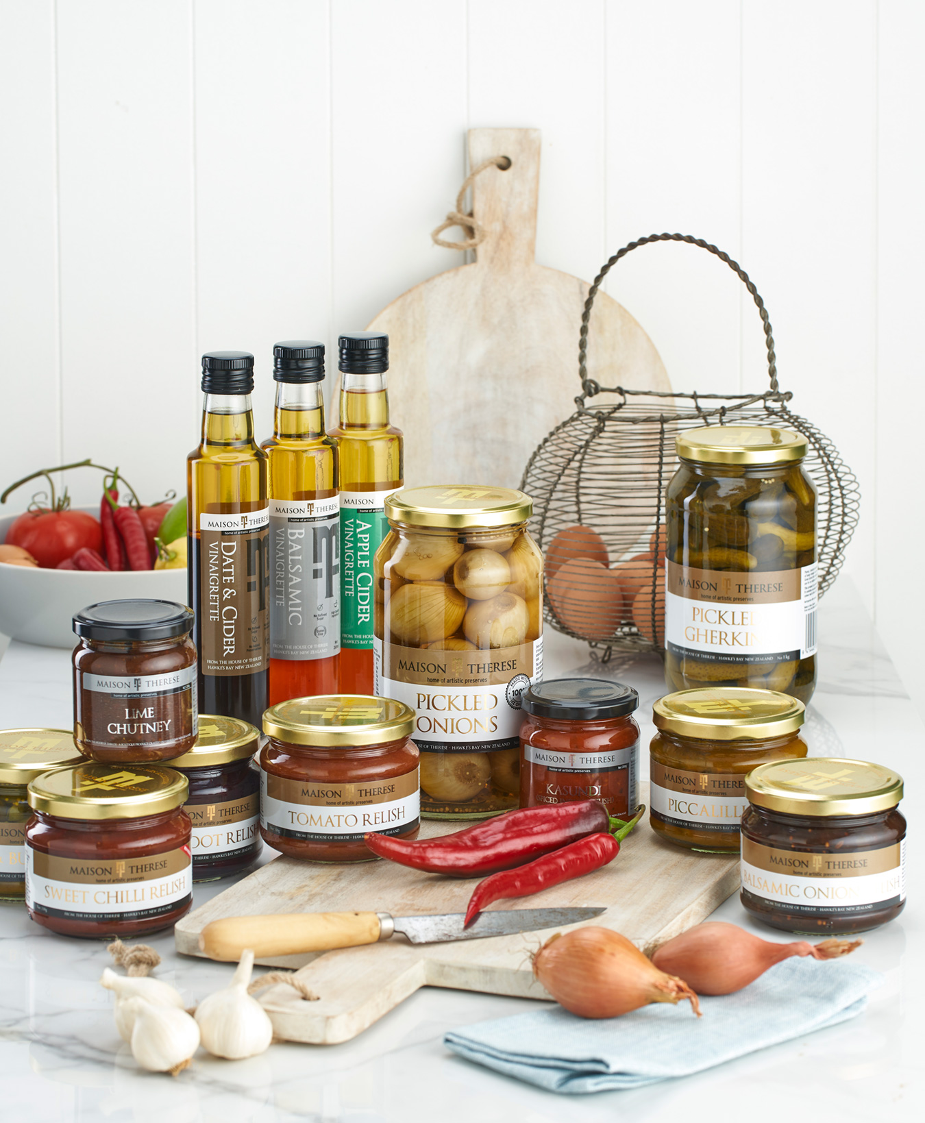
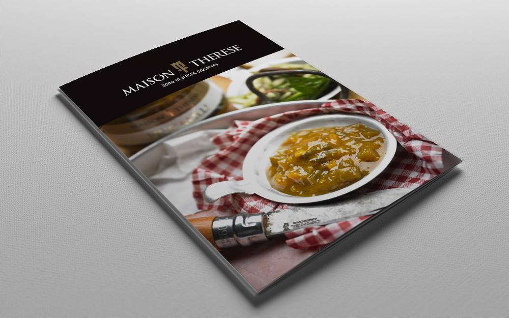
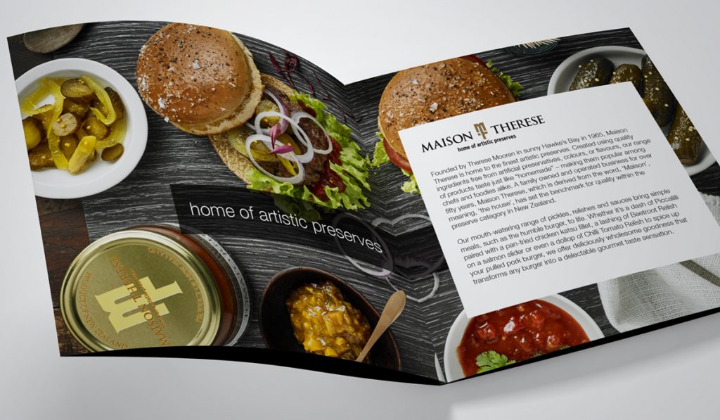
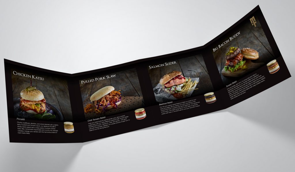
When they approached us their brand was tired. It lacked the visual impact to get ranged in the supermarket or be recognized as a premium gourmet product inside boutique food stores. It was clear their new identity needed to showcase these beautiful hand-crafted preserves.
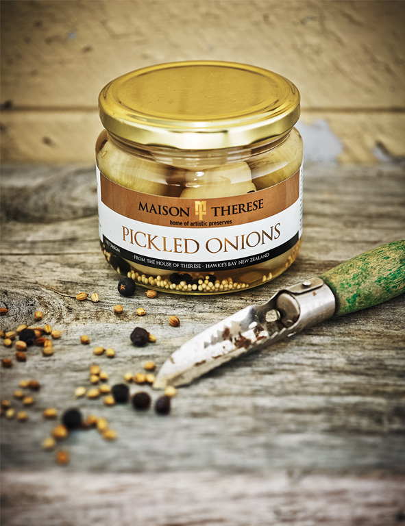
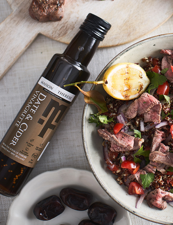
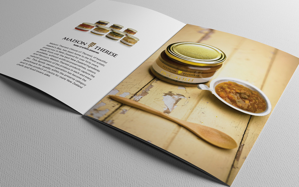
The first step was to create a new elegant logo that embodied tradition and quality. Then a clear synthetic label with a spot metallic foil was developed to fit around a newly shaped jar. This brought a new sophisication to the brand and allowed the ingredients now take centre stage with the vibrant colours available to see and appreciate.
